Every year, there are different presentations about color trends. Earlier, the world's authoritative color forecasting agency, Pantone, released a report on the trend of fashion trends in New York Fashion Week in the spring and summer of 2019, in which red and orange are the main colors.

The early spring and summer of 2019, the four major fashion weeks have further brought the key elements of fashion color. In the autumn and winter of 2018, VENQUE Fanke global new products will be used in 19 spring and summer fashion colors, showing the future fashion trends with 7 key colors.


The biggest feature of 2019 popular color is: emotional attribution
Different colors must be able to represent a special temperament. Gentle, sexy, elegant, gentleman, sunshine, quiet... all can be externalized by appropriate colors. We believe that color is not only about the visual aesthetics of fashion and art, but also about the intrinsic belonging of people's diverse emotions or feelings.
2018 VENQUE Fan Ke autumn winter on the new
Break through the ultimate adventure of color
Deductive exploration of fabrics
The world's first "new color + new fabric"
[CROSS ELLE] fashion backpack

Today, let’s talk to everyone about new things.
New product [CROSS ELLE] color articles

[New color and new temperament]
This new product [CROSS ELLE] is not presented in a simple color standard. Instead, it incorporates the popular North American elements such as marble and terrazzo, which make the color appear organic. Gradient texture.

This highly modern color is more advanced and delicate than the solid color. It is also a new fashion attempt. We are also convinced that it is not tacky but sincere, so it also has a lot of fashion sensitive points.
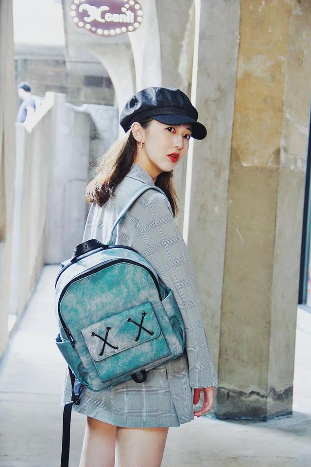
ã€ONTARIO GREEN】

Blue is related to natural elements such as the sky, ocean, and lake, so it is also a combination of spirituality and intellectuality.

This kind of color close to nature often represents a vast and relieved. The blue with high brightness symbolizes freshness and tranquility, and has a tropical style; the blue with low brightness symbolizes solemnity and sublimity, and strengthens a sense of mystery.

And we extracted the special "Ontario Lake Blue" from Canada's most representative mysterious lake [Ontario]

This color has a fresh tropical ocean and a faint green emerald. This blue+green blend has a mysterious color.
ã€STONE YELLOW】

Yellow is one of the three primary colors of color, because it is the most easily absorbed color in the spectrum, so it is the brightest color of all colors.

As one of the benchmark colors of warm colors, it is the first color that people see when they are born. Yellow gives a happy and energetic impression. Often associated with optimism, revelation, and happiness, it is a symbol of health.

And with regard to yellow, whether it is the playful mimosa yellow or the spice yellow, people will think of autumn, leaves and other intentions, so yellow is also gentle, lazy and gorgeous. And we will bring three kinds of gentle and peaceful, with a little warm color ("Mimosa Yellow" and "Monk Camel", "natural khaki" for a certain blend), forming the most representative of "gentle peace" affinity Exclusive color.

Green plants, green leaves, jungles... green is the representative color of nature and vitality.

From army green, fresh emerald color, marble green, sulphur green to kelp green, deep jungle green, bubble green, billiard green, and different shades of green, the fashion trends and emotional expressions are different.

We choose a yellowish sulphur green, and a brightly bright green, bright saturated green to subtle and calm olive green transition, showing the colors of life in two different life states from different stages of youth to maturity.

ã€SPRING GREEN】

The bright saturated green is lighter and more fashionable, just like the younger machine and the vigorous hope represented by the younger state, and also has the breath of spring.

[OLIVE]

The subtle and calm green from the transition from olive green is more mature, warm and elegant. Like a broken butterfly, it is a kind of maturity and growth.
ã€NATURAL ORANGE】

Orange, a bright, bright, pleasant color.

It often produces a different chemical reaction than red. Orange, orange, crimson, scarlet, burgundy...

During this different red interpretation, the orange glaze orange has a red atmosphere and a bright orange warmth.

The most famous feature of the Morandi color, which is known as the Raiders of the Raiders, is the addition of a "grey tone" to all colors.
Gray, known as the "gentleman" in the color, soft visual sense and comfort, in addition to good-looking and emotional care, because the gray people like psychology, mostly well-educated and knowledgeable people.

And we extract two kinds of special "grey" between dark gray and light gray, which show the charm of life in the state of near black and near white respectively.

ã€LIGHT GREY】

The near-white cream ash is more representative of natural purity.

The free cream ash is closer to white, not purer than black and white, and it is not like black and white. The innate texture is fascinating and more natural and pure.

ã€MATTE GREY】

Matte gray that is closer to black is a restrained and mature.

Just like a connoisseur "gentleman" hides high, steady, elegant, not unassuming but heavy enough.

Are you satisfied with the visual stuns of the above seven VENQUE Fanke key colors? This double 11 is a hurry to be a fashionable person in advance. Go back to Sohu and see more